

Boost Your Image with the Power of Color
By Kavya Anand | 17 Jul, 2026
The colors you wear can have a profound and unexpected effect on how people view and respond to you.
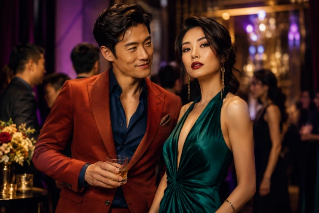
Most of us think of clothing color as a matter of taste. We like navy, hate orange, look washed out in beige or feel mysteriously better in forest green. But color also works as social shorthand. Before you say a word, the color you’re wearing has already started making little introductions on your behalf. It can suggest confidence, warmth, creativity, discipline, romance, calm, seriousness, playfulness or power.
That doesn’t mean color psychology is magic. A red blouse won’t make a timid person irresistible. A navy suit won’t turn a sloppy thinker into a trusted strategist. A black dress won’t make every wearer look elegant. Fit, grooming, posture, expression, voice and setting still matter more. But color is one of the easiest image signals to adjust, and the research suggests people do respond to it.
Psychologists Andrew Elliot and Markus Maier have argued that color works “in context,” meaning a color doesn’t carry one fixed meaning everywhere. Red in a Valentine’s Day setting doesn’t say the same thing as red on a graded exam, a stop sign or a boxing glove. Their review of color research found that color can influence affect, cognition and behavior, especially in achievement, attraction, consumer and evaluation settings. (PubMed)
That’s the practical point. You don’t need to obey rigid rules like “blue means trustworthy” or “red means passion.” You need to ask what role you’re playing, what response you want to encourage and what part of your real personality you want to make easier for others to see.
Start with the image you want to project
Good personal style begins with self-knowledge. Are you trying to look authoritative, approachable, elegant, youthful, inventive, serene, glamorous, rigorous or romantic? Most people need several versions of themselves. The same person may want to look decisive in a client meeting, warm at a family gathering, relaxed on a date, polished at a fundraiser and quietly competent on a normal workday.
Color lets you tune those impressions without changing your entire wardrobe. Navy, charcoal, black and deep brown usually communicate stability and seriousness. Cream, camel, soft gray and muted blue feel more relaxed and diplomatic. Red, magenta, cobalt and emerald create more visual energy. Pastels soften the face and make the wearer seem more open. Earth tones suggest groundedness and restraint. Metallics, jewel tones and high contrast combinations add drama.
The best strategy isn’t to copy someone else’s color palette. It’s to build a set of colors that amplify the traits you actually want people to notice. A naturally forceful person may not need more red or black; they may benefit from softer blues, warm taupes or open-collar white. A gentle person who wants to be taken more seriously may need navy, burgundy, deep green or charcoal. A creative person may want unusual combinations that suggest imagination without looking chaotic.
Red: Energy, Dominance and Romantic Charge
Red is the loudest social color in the wardrobe. It draws the eye quickly and tends to raise the emotional temperature of a look. It can suggest courage, sensuality, urgency and dominance. That makes it useful when you want to be remembered, but risky when you need to seem calm, neutral or collaborative.
A famous 2005 Nature paper by Russell Hill and Robert Barton found that athletes wearing red in certain combat sports were associated with a higher probability of winning, suggesting that red may influence competitive perception or performance. Later work has complicated that finding; a 2024 meta-analysis and more recent reporting suggest the “red advantage” in combat sports is not as strong or reliable as the original result implied. Still, the cultural and biological association between red and competition remains powerful enough to make red a high-impact wardrobe choice. (Nature)
Red has also been studied in attraction. Elliot and Daniela Niesta reported in 2008 that men rated women as more attractive and sexually desirable when associated with red, though later studies have found limits and mixed results. The takeaway isn’t that everyone should wear red on dates. It’s that red is rarely neutral. It attracts attention, sharpens the body’s outline and suggests intensity. (PubMed)
For professional life, red works best as an accent unless your role rewards boldness. A red tie, lipstick, pocket square, scarf, heel or bag can add force to navy, gray, black or camel. A full red dress or suit can be terrific for a speaker, performer, host or entrepreneur, but overpowering for a mediator, therapist, analyst or job applicant trying to project steadiness.
Blue: Trust, Clarity and Mental Space
Blue may be the safest power color because it combines authority with emotional coolness. Navy is the great default of business because it’s serious without the severity of black. Medium blue can feel friendly and energetic. Pale blue often softens the face and suggests openness. Cobalt adds confidence and modernity without the heat of red.
A 2009 Science study by Ravi Mehta and Juliet Zhu found that red and blue influenced different kinds of cognitive performance. In their experiments, red enhanced performance on detail-oriented tasks, while blue improved performance on creative tasks. The researchers argued that red activates caution and vigilance, while blue encourages an approach-oriented, exploratory mindset. (PubMed)
That finding translates nicely into clothing strategy. Wear navy, slate or blue-gray when you want to look reliable, analytical and composed. Wear brighter blue when you want to seem inventive, optimistic and open to new ideas. Blue is especially useful for people whose personalities are intense, fast-moving or verbally dominant because it cools the impression. It says, “I’m in control of myself.”
The danger of blue is blandness. Too much navy, especially in conservative cuts, can disappear into the background. If your image problem is that people overlook you, add contrast: a crisp white shirt, a patterned scarf, a textured blazer, a silver accessory or a brighter blue near the face.
Black: Authority, Edge and Distance
Black is the most efficient color for creating drama. It sharpens the silhouette, suggests urbanity and makes inexpensive clothes look more intentional. It’s the uniform of artists, editors, architects, performers, executives and people who don’t want to explain themselves.
But black can also create emotional distance. Frank and Gilovich’s 1988 study of black uniforms in professional football and hockey found that teams wearing black were associated with greater aggression, and experiments suggested that black clothing could influence both self-perception and observers’ judgments. You don’t need to take that as a warning against black. It’s more useful as a reminder that black has psychological weight. (PubMed)
If your personality is warm and expressive, black can give you polish and authority. If your personality is already guarded or severe, black may make you seem less approachable. The solution is texture and exposure: black cashmere, black silk, black linen, black with bare arms, black with a soft neckline, black with pearl, gold or warm brown accents. Those details keep black from becoming a wall.
White, Cream and Gray: Polish without Noise
White is crisp, clean and clarifying. It frames the face, brightens the eyes and creates a sense of freshness. A white shirt under a navy jacket may be the most reliable competence signal in modern dress. But stark white can also feel clinical or high-maintenance, especially on people whose coloring is softer. Cream, ivory and warm white often look more flattering and humane.
Gray is the great negotiator. Light gray is calm and intelligent. Charcoal is serious and executive. Silver-gray can be elegant and futuristic. Gray’s weakness is that it can look passive when worn without contrast. If you’re wearing gray to project competence, make sure the cut is sharp, the fabric has quality and the rest of the outfit has one deliberate point of interest.
For people with big personalities, white, cream and gray can make them seem more refined. For people with quieter personalities, these colors need support from structure, jewelry, strong shoes or a richer accent color.
Green, Brown and Earth Tones: Grounded and Humane
Green and brown are underrated image colors because they don’t scream for attention. They suggest nature, steadiness, patience and depth. Olive, moss, espresso, tobacco, rust, camel and forest green work especially well for people who want to appear thoughtful rather than flashy.
Green can be a wonderful alternative to blue for people in advisory roles. Deep green feels intelligent and calm but less corporate than navy. Olive can look practical and quietly stylish. Emerald, on the other hand, is a jewel tone with glamour and confidence.
Brown has returned because it offers warmth without softness. A deep brown jacket, chocolate knit or camel coat can make the wearer seem substantial and approachable at the same time. For people who find black too harsh and navy too predictable, brown may be the missing anchor.
Pink, Purple and Softer Colors: Warmth, Charm and Imagination
Pink has matured beyond its old stereotypes. Pale pink can make the wearer seem gentle, socially fluent and emotionally available. Strong pink or fuchsia can feel bold, witty and modern. On men, pink often signals confidence precisely because it shows comfort with warmth and play.
Purple is more complicated. Deep plum and aubergine suggest sophistication and introspection. Lavender can be dreamy, artistic or delicate. Bright purple can look theatrical. These colors work best when they connect to the wearer’s actual personality. On the right person, purple feels creative and memorable. On the wrong person, it can look like costume.
Softer colors are especially helpful when your goal is trust rather than dominance. Teachers, doctors, counselors, managers, hosts and anyone delivering criticism may benefit from colors that lower defensiveness. A soft blue sweater, dusty rose blouse or sage jacket can change the emotional setting of a conversation.
Let Hair, Eyes and Skin Tone Shape Your Color Choices
Personality and message matter, but clothing color also has to cooperate with your natural coloring. The same emerald blouse that makes one person look luminous can make another look tired. The same camel coat that looks expensive on one person can drain the life from another. That’s because clothing color is seen in relation to the colors already present in your face: skin tone, hair color, eye color, lip color and the contrast among them.
Skin tone is the starting point. People with cool undertones often look especially good in blue-based colors: navy, charcoal, blue-red, raspberry, rose, plum, emerald, icy pink, cobalt and crisp white. People with warm undertones are often flattered by yellow-based or earthy colors: camel, ivory, olive, rust, coral, tomato red, mustard, chocolate, bronze and warm beige. People with neutral undertones can usually borrow from both sides, though they still need to watch intensity and contrast.
Hair color affects how much visual weight an outfit can handle. Very dark hair often works beautifully with strong contrast: black and white, navy and cream, deep red, emerald, cobalt, charcoal, bright pink or jewel tones. Light blond, silver or soft brown hair may look more harmonious with lower-contrast combinations: dove gray, cream, powder blue, sage, dusty rose, lavender, taupe or soft navy. Red hair often comes alive with greens, teals, warm browns, ivory, navy and coppery earth tones, while very orange or overly red clothing can compete with it.
Eye color can be used as a quiet amplifier. Wearing a color related to your eyes often makes the face seem more vivid. Blue eyes may brighten near navy, denim, slate, sky blue or soft gray. Green or hazel eyes often stand out with olive, moss, teal, bronze, plum or chocolate. Brown eyes can be deepened by espresso, burgundy, forest green, camel, cream, gold, navy or warm rust. This doesn’t mean matching your eyes exactly. Often a neighboring or contrasting color does more than a literal match.
The most overlooked factor is contrast. Some people have naturally high contrast: dark hair with light skin, bright eyes with deep hair, or sharply defined features. They can usually handle stronger color differences in clothing. Others have softer contrast: similar values among hair, skin and eyes. They often look better when their clothing colors blend more gently. A high-contrast person may look striking in black and white. A low-contrast person may look more elegant in ivory and taupe, soft navy and gray, or sage and cream.
This is why “the right color” isn’t universal. Red may be powerful, but the best red depends on the person. A cool-toned person may look better in blue-red, cranberry or wine. A warm-toned person may glow in tomato, coral or brick. Black may look dramatic on someone with dark hair and high contrast, but harsh on someone with soft blond hair and delicate coloring. Camel may look rich and natural on warm-toned skin, but muddy on cool-toned skin.
The practical rule is simple: the best clothing colors make your face look clearer, healthier and more alive. The wrong ones make shadows look deeper, skin look duller, eyes look flatter or teeth look less bright. Before buying a color because it sends the right message, hold it near your face in natural light. The color should support both your image and your actual coloring. When it does both, people may not notice the clothing first. They’ll notice you.
Colors Affects the Wearer Too
Color doesn’t just influence how others see us. Clothing can influence how we see ourselves. In a 2012 Journal of Experimental Social Psychology paper, Hajo Adam and Adam Galinsky introduced the term “enclothed cognition” to describe how clothes affect the wearer’s psychological processes through both symbolic meaning and the physical act of wearing them. In their experiments, people performed differently when wearing a white coat depending on whether it was described as a doctor’s coat or a painter’s coat. (ScienceDirect)
That matters because the best colors don’t merely flatter your skin. They help you enter the state you need. A person may wear navy to become more disciplined, red to become braver, cream to become softer, black to become more focused or green to become steadier. The effect may be subtle, but subtle changes in self-presentation often produce real changes in behavior.
The Best Palette Is Strategic, Not Restrictive
The old seasonal-color systems can be useful, but they become limiting when treated as law. It’s helpful to know whether you generally look better in cool or warm colors, clear or muted colors, high contrast or low contrast. But image isn’t only about complexion. Sometimes the “flattering” color isn’t the most effective color. A soft autumn palette may flatter your face, but a sharp navy suit may better serve your authority. A black dress may be too harsh in daylight but perfect at night. A red jacket may be too much for the office but exactly right on stage.
A smart wardrobe has three color zones. First are your anchors: the neutrals that make you look credible and pulled together. These might be navy, charcoal, black, camel, cream, brown or olive. Second are your personality colors: the shades that make you feel most like yourself. These might be teal, burgundy, rose, cobalt, emerald, rust or lavender. Third are your strategic accents: colors you use when you want to shift the room’s response.
The more public your role, the more deliberate this becomes. Politicians, CEOs, broadcasters, performers and trial lawyers understand that color is part of the message. But the same principle applies to everyone. On a first date, color can make you seem warmer. In a negotiation, it can make you seem steadier. At a reunion, it can make you seem more vibrant. In a job interview, it can help people remember you for the right reasons.
Color won’t create a personality you don’t have. What it can do is bring the right part of your personality forward at the right time. That’s the real art of dressing well: not chasing trends, not hiding flaws, not obeying rules, but coordinating the visible you with the social moment you’re about to enter.
I can also make it more fashion-magazine stylish, more practical and service-oriented, or more science-heavy.
© 2026 by Asian Media Group Inc.
Recent Articles
- Chipmakers' Big Profit Gains May Not Be Enough
- Blockbuster Films Produce Record Revenues for AMC
- Archer, Anduril Unveil Autonomous Aircraft Platform for Defense
- Why Oil Prices Haven't Gone Crazy Despite 5 Months of US-Iran Conflict
- Suzuki's No-Frills Cars Once Ruled India. Then Buyers Demanded Frills.
- Japanese Mayor Makes History with Maternity Leave That Caused a Stir
- Chinese Brave Simulated Typhoons to Prepare for the Real Thing
- GE Aerospace Unveils Breakthrough in Hybrid-Electric Flight
- Houthi Red Sea Blockade Tightens Iran's Grip on Global Energy Supplies
- Google's Newest Chip to Run Gemini Models 6 Times More Efficiently